Lecture transcript. Part II. Dubai.
Please see the Financial Risk Management Training Course page for background, related transcripts, resources and downloads.
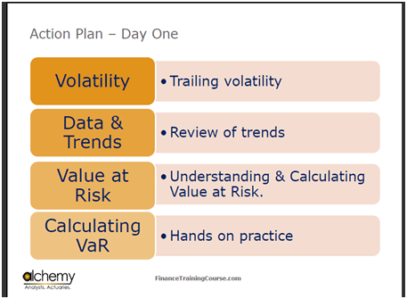
Figure 1 Risk Management Workshop: Action plan
Risk Management: Volatility, Value at Risk (VaR)
Now to our Action Plan. Today we will cover volatility, and we will spend some more time on it. We have looked at some of the trends, but I want to look at more trends later on. I also want to do Value at Risk (VaR) and Calculating VaR.
Ghazal has uploaded an excel sheet, so if you could download and open that, then we could start with exercises. (For those of you joining us from outside SP Jain please check the Financial Risk Management Training Course page for related resources and downloads).
You have a handful of questions that you need to address for tomorrow’s case submission. Ground rules are very simple. You have already been assigned two groups. For each case that we have discussed, each group will submit a 2 or a maximum 3 page written report which is due before the start of class.
For tomorrow, there are two cases: Air Canada and GM. There is a lot of material in them, but the questions that I am asking are very simple questions, and these will be an extension of the work that we are going to do now. The questions that I am going to ask are already posted on Blackboard, and once we have done this, we will go back to the questions and see what we can answer. For Air Canada, the primary question is of oil and profitability, while for GM it is the Canadian Dollar and profitability. One of the products is a commodity, while the other is an exchange rate.
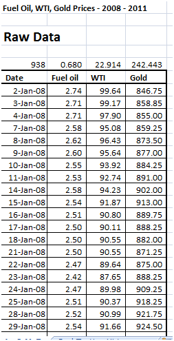
Figure 2 Snapshot of Excel Sheet with WTI,fuel oil and gold prices
Value at Risk Review: Calculating Value at Risk exercise
I have three things here, the prices of fuel oil, WTI and gold. Look at this series to read the values of a litre of fuel oil, a barrel of WTI and an ounce of gold. This session has three objectives. The first objective is to learn how to calculate volatility or standard deviation. The second objective is to learn how to use that volatility to calculate Value at Risk, and the third objective is to figure out how to use the Value at Risk to figure out what your exposure is or should be.
The fourth question is about figuring out what the correlations were. So far, the way that you have covered statistics with respect to calculating standard deviation would simply be by using the formula in Excel. However, this standard deviation has a problem. The problem is that if you were to look at the changes in the price, they have been phenomenal.
Value at Risk Review: Calculating Volatility or Vol
This method simply states in this case that the unit of volatility for fuel is 68 cents, for WTI is $22 and for gold is $242. But what happens when the price of gold comes down to $200, or the price of fuel comes down to $10? This figure becomes irrelevant. Therefore, we will use a slightly different approach which will allow us to preserve the relative value involved in this specific case. Let’s start with WTI.
I want you to simply copy and paste the WTI figures so that I have space to play with these figures. We have about three years of data, which translates into roughly 1000 lines. SO we have about 950 points of data for the dates in question. Now I will use a simple formula to calculate the change in price. One way for calculating the percentage change in price between two days is by using the formula (P1-P0)/P0. The other method, which is an approximation, that we use in the field of risk is by using the formula ln(P1/P0). What I have done is that I have calculated the relative change in the price, irrespective of the price level, and this relative change is a very small change of about 0.5 percent. We will now copy and paste this all the way down to the end of the series. This is my Percentage Return, and shows by how much prices have come up or gone down on a day to day basis over the next 3 years. Now, when I take the standard deviation of this series by applying the STDEV function, the standard deviation that I get is relative standard deviation. The number that I get is 3.03 %.
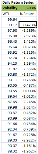
Figure 3 Value at Risk (VaR) Calculating daily returns
What is this 3.03 %? It is the daily volatility in the price of WTI. What is my monthly and weekly Vol? There are 52 weeks in a year and 5 trading days in a week. Multiplying 3.03% with the square root of 5 gives me the weekly Vol, which in this case is around 6.8%. The monthly Vol is equal to the daily Vol times the square root of 22. The Yearly Vol is the daily Vol times the square root of 250.
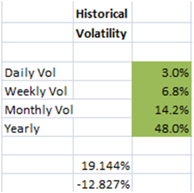
Figure 4 Calculating Value at Risk Example. Results
Calculating Value at Risk. From Volatility to Value at Risk
How many of you have heard of Value at Risk?
The concept of Value at Risk is to figure out what’s the worst-case loss. There are many ways of looking at value at risk. One way is to define the most unlikely scenario. So for instance, we define one standard deviation as likely, which comes down to about 66%.
66th percentile is around 1 in 3 days. If you have a large enough data set, you should see this value once every three days. 99th percentile is 1 in 100 days. If you have three years data, then you should see this value a total of 9 times. If you do 99.99 percentile, you have 1 in 1000 days. So if you have a three years data, you should see it only once. This is the benchmark. One way of looking at value at risk is to calculate value at risk at these different percentiles. What’s the likely movement that we are expected to see once in three days, once in a year, and once in three years?
We will now calculate this.
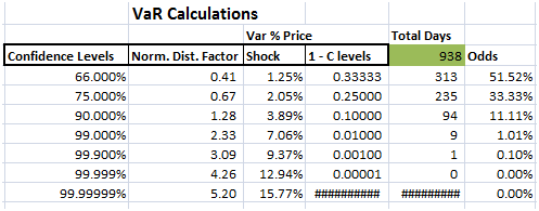
Figure 5 Calculating Value at Risk (VaR) example. VaR Table
Calculating Value at Risk (VaR). Presenting and Interpreting VaR results
In Excel, you have a function that allows you to calculate the appropriate percentile. This function is called the NORMSINV function. So we have 66th,75th,90th,99th,99.9th and the 99.9999th percentiles. Put these values in the NORMSINV to calculate the appropriate percentiles for all of these cases. So now, if I want to see this change, then simply multiply these percentile levels with the daily volatility. For 1 in 3 days, there is a price movement of 1.25%. If I scroll down throughout the series, these are the values that we will get for these percentiles, which we call the confidence levels. For each of these confidence levels, we first obtained the normal distribution factor and a corresponding Price Shock.
You have all done the Normal distribution right?
In the first instance, 0.5 is right in the middle of the curve. If I go on the extreme right, I get 1, and if I go on the extreme left, I get 0. Now, give me an instance which corresponds to a 66th percentile level, which means that there is just a one-third chance that I will see a number that is higher than 1.25%,which is the relative price shock.
For instance if oil price is at $100 a barrel, there is only a 33% chance that you will see a daily price change of more than $1.25.Similarly, if I tell you to give me a percentile that corresponds to 75, then there’s only a 25% chance that you will see a price shock of more than 2.05%. There’s only a 10% chance that you will see a price shock of more than 3.89%, a 1% chance that you will see a price shock of more than 7%, a 0.1% chance for a price shock of more than 9%, and there is literally no chance, at least as far as this model is concerned, that we see a price shock of more than 13% in a given day.
The underlying distribution that we are about to see is not Normal. My count is that I have three years worth of data. Let’s now think in terms of odds of happening. These come out to be 1 by 2, 1 by 4,1 by 10, 1 by 100,1 by 1000, and 1 by 100000 for the percentiles discussed previously. I have a total of 938 data points. For these data points, I should see 300 days for a relative price shock of 1.25%, 2 days for 2%, 1 day for 3.89%, and the rest of them should be 0.
Calculating Value at Risk. Building Histograms using Excel.
Excel has a very simple tool that allows us to calculate a histogram. Simply select the data, go to Data, then click on Data Analysis tab. In the tab, click on Histogram. In the input range, pick up the percentage returns. Click on Chart output and also on Cumulative Percentage.Finally, press OK.
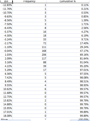
Figure 6 Calculating Value at Risk. Building a Histogram using Excel for VaR – Historical Simulation Approach
Figure 7 Back Testing the VaR Historical Simulation results
The original assumption that we made with respect to our analysis was each confidence level corresponding to a specific number of days. Now, let’s see how what we did earlier compares with actual data. Move the cursor to where the data bins are. The first bin that you were interested to look at was at 66 percentile, where you are expected to see the price shock for 300 days. Taking 1.03% as the benchmark, the number of days greater than 1% comes out to be 495, and not 368, as we had expected. The number of days greater than 2% come out as 289. We can do this for 3%,4%,7% and 10%. Now let us compare this data with our assumptions. We said that for over 10%, you should have just 1 instance, while for over 7%, you should have just 9. In reality, over 7% occurs for 23 days, and over 9% occurs for 10 days.
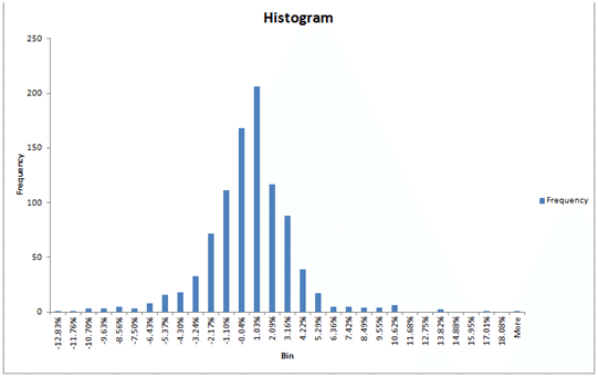
Figure 8 Calculating Value at Risk (VaR). VaR Histogram for Historical Simulation
Calculating Value at Risk: Reading the Histogram for Historical Simulation
Look at the shape of the histogram produced by the chart output. Does it look Normal? It is not.
In a Normal Distribution, the mean, median and the mode occur at the same point. If you look at the cumulative distribution chart, you will see that it’s not exactly Normal. Plus, this distribution is very slightly skewed. On the extreme right, the value is 12.83%, but the other end is -18%.
If it had been symmetric, both the ends would have been at 12.83%. The data is also a bit clustered in the centre. There are two more characteristics as well. One is kurtosis, and the other one is skewness. If you do a skewness and kurtosis score for this distribution, you will find that it fails the normal test. This is why when you look at the numbers which we have just calculated, they will also fail the normality test.
What you have just done is that you have calculated a worst case loss. A worst case loss has three attributes when it comes to value at risk. The first is the time duration. We did the calculations for one week, one month, and one year. The second is a confidence or a probability level. The definition of value at risk is the worst that can happen over a given time horizon at a certain confidence level. What you have just done in your first session is that you have calculated value at risk for WTI. I have also given you the numbers for fuel oil, which is what Air Canada would use. I have also given you the numbers for gold, which you could possibly look at to get a sense of where the global economy is heading .You can also look at the correlation between fuel oil, WTI and gold.
The primary questions that you have to answer for both Air Canada and WTI is related to using this piece that you have just done and connecting it to numbers.
For instance, if the price change in fuel oil is a dollar and it goes up, what does it do to Air Canada’s income statement? Take the change in price, and push it down all the way to PnL. You will obviously need to make a few assumptions, both for Air Canada as well as for GM.
So you have two scenarios: an oil refinery that is concerned about declining prices, and an airline that is concerned about rising prices. If you see the trend, the range is from 12.8 to 18%. Your focus is on the worst case, which for the airline would be the rising price, and for the refinery would be the decreasing price.
In risk management terms, the exercise that we have done with the histogram is called a back test. We have tested the fit with the distribution. Our assumption was that the underlying distribution is normal. Based on that assumption, we calculated the number of days for each price shock, and then compared these numbers with the actual history. When you see this, it appears that the back test has failed, because the underlying distribution is not normal and some adjustments might need to be made.
Comments are closed.