Sometimes in the midst of an exploratory trip with a data set a relationship just jumps out and surprises you. This happened yesterday evening as I was fooling around with a thesis. While doing my work I noted down a number of presentation rules for Excel charts that I wanted to discuss with our new analysts in training. The rules are driven by common errors I see young analysts make when I review their charts before approving them.
But before we begin, a short rant on the context around analysis that is often forgotten in our rush to build visual graphs and charts.
My beef with analysis.
I hate inaccurate and superficial analysis. You can be forgiven if you are my ten year old daughter or a high school student (though I may push you both around a bit to see what you are made of and if you can find the correct path). Other than a few bright exceptions who treat data and opinions with respect, I rarely take what I read today at face value. You have no idea how refreshing it is to see an opinion based on facts and well thought out analysis. Especially if it challenges accepted wisdom or the current mindset.
With the rant taken care of here is the context for my analysis and the graphs I share a few paragraphs later. My interesting thesis was:
On April 17th both OPEC and non OPEC members meet in Doha and I was curious to see if the meeting as an event was driving oil prices up. This would imply that the market was pricing in the possibility of a deal, which seemed at odds with the opinion of a number of oil analysts, including our own in house team. However financial media coverage was making a big push for the Doha meeting impacting oil price. So who was right; financial media coverage or oil analysts?
Forming opinions.
My first step when I start exploring any topic is to read. Before I form my own opinions I want to hear all sides of the story and gather as much data as possible. I don’t want to pen and publish a piece dissing the likelihood of finding life on Mars just as NASA is breaking the news of having found life on Mars. I also want to ensure that I understand the issues involved and take my own advice – provide a balance coverage of all point of views to my readers.
Once I form my opinion I go looking for data and analysis both in favor and against it. I keep an open mind and I can change my position as long as I see compelling content that can convince me of being right or wrong. The joys of reading opinions from across the world is that you find an alternate thesis that you can make and call your own.
In the Doha’s meeting case, the compelling arguments and data were both missing. There was apparent causality given the trajectory of the event and prices, but no basis or model for that causality. A lot of talk and very little action and given the players involved the required action doesn’t seem probable. There had to be some other driver pushing prices up. Because Doha was the most visible event on the horizon it was getting all the credit. Attribution is easy, credible justification is not.
The data set for my Excel charts.
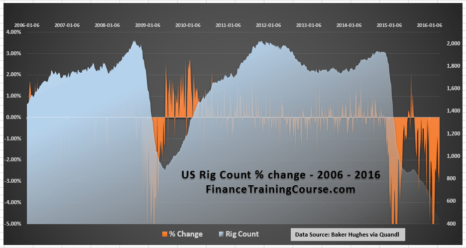
The interesting relationship I found dealt with the falling US oil rig count and US crude oil production. While US rig count has fallen by 76% over a fifteen month period, US crude oil production had only declined by 15% over the same time period. The rig count figure is reported every Friday and media coverage presents each drop with depressing write-ups about what the drop means for the future of oil production in the US and a sure sign that crude oil prices are finally going to rise again from the dead.
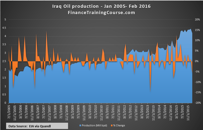
My core data set included the rig count updates and rig productivity data issued by EIA, US crude oil production figures also released by EIA. Iraq and Russian Federation crude oil production sourced from a range of databases, the EUR-USD foreign exchange rate collected via Quandl (my favorite free data source) and a number of additional calculations and filters.
Lesson One – Tweak your Excel chart axis.
When I looked through the rig count data set two views or presentations were possible. Let’s take a quick look at both views:
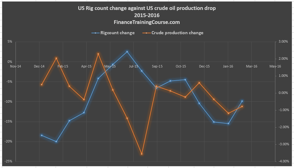
Chart A – Using two separate axis for the two metrics
Chart A used a primary axis (on the left) to display the results for change in rig count and a secondary axis to display the change in crude oil production.
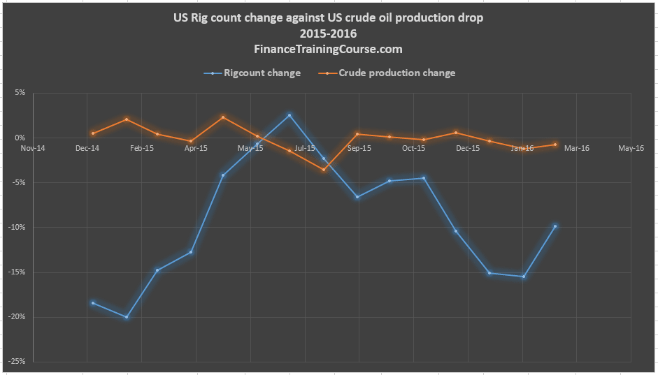
Chart B – Using the same axis for the two metrics
Chart B used the same primary axis to display the change for both metrics.
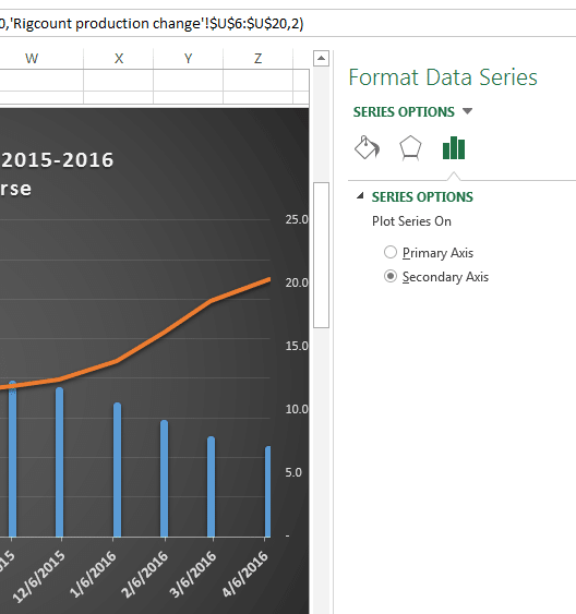
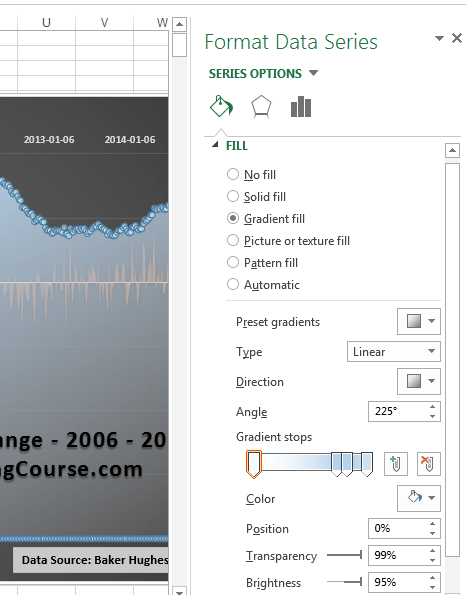
To access the Format data series option, click and select your data series on the graph, then right click to open the Excel pop up menu. In Excel 2013 and above you will see the Format Data Series option. Click on the histogram bars icon and pick your choice of primary or secondary axis for your series.
Before you proceed, take a step back and think. Which one of these presentations do you prefer? Which one of these charts pushes you towards a clear and specific interpretation?
I lean towards Chart B because I like the thought that this hoopla about rig count has very little impact on actual crude oil production in the US. It also supports my bias that most financial journalists before expressing opinions about the end of the world for the oil patch based on rig count changes were simply not doing their homework.
Conversely if I wanted to at least convey the image of a close relationship between change in rig count and the change in crude oil production, as my friends in financial media are wont to do, I would have leaned towards Chart A.
There are instances when the usage of a secondary axis adds clarity to your presentation as well as your thought. This – the relationship between rig count and oil production – is clearly not one of these instances. You can use the secondary axis to confuse the issue or forward your point of view.
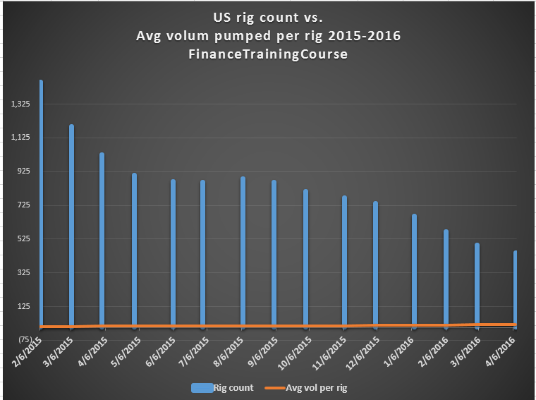
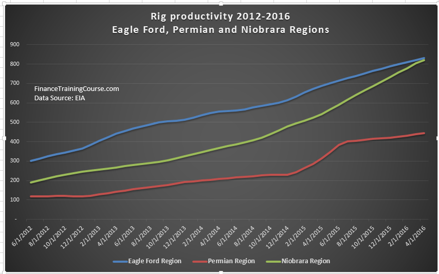
Chart C presents an instance where a secondary axis is clearly required. It presents a different data set related to the same topic using two separate axis. A primary axis for the actual rig count value (left) and a secondary axis for the average volume of crude oil pumped by a rig for the same period. The relationship being displayed is the rise in rig productivity as rig counts falls across 2015.
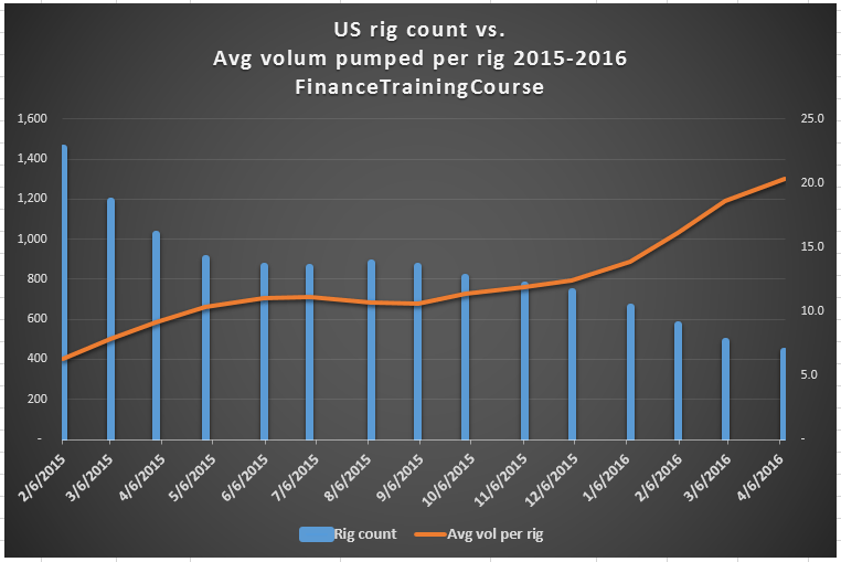
Without a secondary axis, Chart C would transform into Chart D. The removal of the axis kills the graph and the relationship that was being portrayed so well in Chart C. This happens because the two scales don’t relate to each other in a visual setting. One ranges in the thousands, the other in tens and twentys.
Can you improve on Chart C?
Yes, you can. Slightly but certainly an improvement. Take a look at our new and new improved Chart E side by side with our original Chart C. Which one do you prefer? Can you tell the tweak we have used to transform C into E?
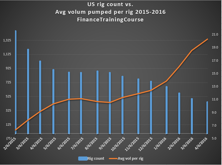
The relationship displayed in E is significantly steeper than the relationship in C. This was made possible by adjusting the starting and ending points for both scales. Excel by default picks proportionate values for the scale. You can tweak that to share a different perspective.
Here is another example. Meet Chart F and Chart G.
What are some of the immediate fixes that come to your mind when you view chart F. There is room for improvement on the scale front. It would also help if we could place the date labels some place else.
Minor differences created by tweaking the axis on the left and right hand side lead to a slightly steeper curve and more readable data in Chart G compared to Chart F.
I like steeper curves because I want to use all the real estate available to me on a chart to convey the information or message I need to convey.
But in addition to the steepness, there are two other adjustments made to Chart G compared to Chart F. Can you spot them?
To change the axis, click and select the axis you want to tweak, right click to get to the Excel pop up menu and then chose Format Axis. Change the minimum and maximum bounds to get the desired effect.
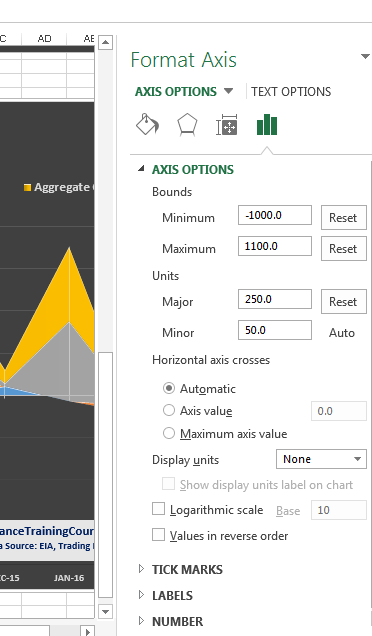
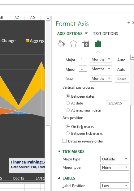
To access the label menu, double click on the horizontal axis to open the format axis menu on the right. Click on labels and scroll all the way down to label position. Pick the most suitable position that gets the labels out of the way of your plot.
Lesson Number Two – Analyzing a relationship? Focus on rate of change or relative change.
When faced with two variables that you are trying to link through a relationship, what should you focus on? Absolute values or rate of change?
Given a choice I prefer to opt for rate of change. I use it to calculate volatility, correlations, moving averages and trends for returns. I use absolute values to show a trend and how the variables have changed. There are certain presentations where my analysis needs and is based on absolute values and there are other were I mix and match both. But the most fun I have is with rate of change.
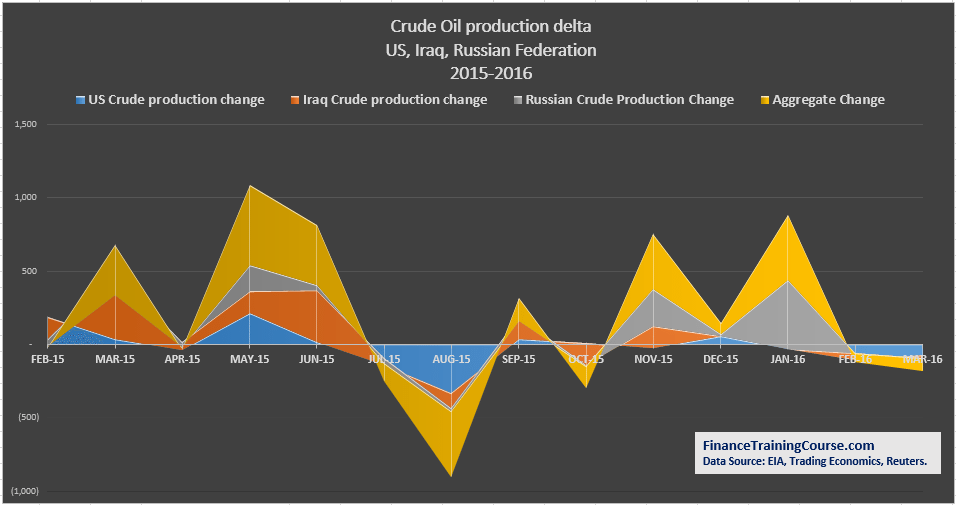
In Charts A and B I used relative rate of change. In C and D I use absolute values because that is the unit of my analysis. In Chart F and Chart G I use rate of change (values not percentages).
One of my favorite technique is to calculate rolling or trailing volatilities or correlations and plot them against the relative rate of change. Chart H provides a sample of this technique.
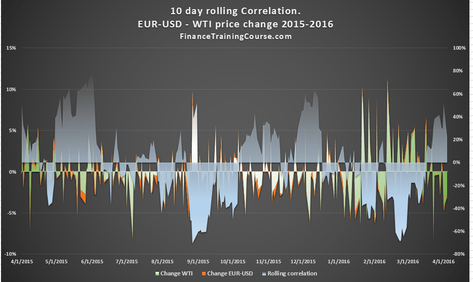
But you have to be careful using this variation because it often leads to information over load and is a great example of sacrificing clarity for information. Most audience members in my training session hate this chart because unlike the versions A through G, H is a lost cause.
There is no clear message or relationship at display. Sure if you follow crude oil and understand the link between crude oil prices and the USD exchange rate, you may see the link. But Chart H commits a cardinal sin. It makes you think. You can’t understand the message or the relationship without really applying your mind. Steve Krug wrote a brilliant book on usability and UX design titled “Don’t Make Me think”. That needs to be your calling card as an analyst using Excel charts to communicate information.
Remember simpler, clearer, cleaner is better than fancier.
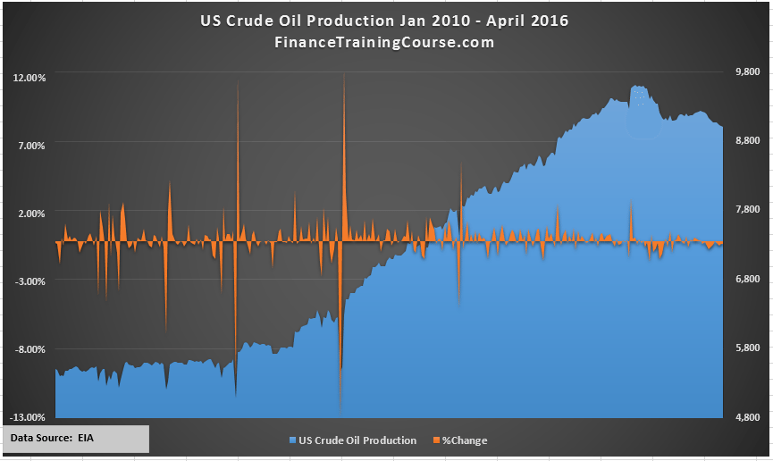
Now compare Chart H with Chart I. We are back in the zone of clarity. Chart I is also a good example of mixing relative change with the underlying variable. It applies all the principles we discussed in Lesson One including the usage of two axis and tweaking the range the axis plot for the graph on the left and right hand side.
Here is how the original Chart I looked when I first plotted it without all the tweaks.
My final example is Chart J.
Notice the difference setting for the title. But in my zeal to utilize real estate I cropped the bottom and forgot to do a quality check before I posted and used this chart.
There is also a common theme across Chart H, I and J. Chart H and Chart J use the Excel gradient functionality to show the parts of the plot hidden behind the main series. Chart I uses a different technique to achieve the same effect.
To access the gradient setting, you would again need to get to the Format Data Series menu. Pick gradient fill under Fill and then chose 90% – 99% transparency to get your desired effects.
Final notes – Be one with the plot.
Pick up any book on presentation zen, pitching and make great power point slide deck. Within the advice across all of them you will find some common themes. Simplify your story, keep a tight focus, use a dark background, large fonts and don’t clutter your deck with too many bullets. The same advice works well with Excel charts.
Treat each graph, each plot like a slide in your pitching slide deck. Keep it simple (ideally no more than two variables), keep the story, the message in front of you (what is the plot supposed to show) and make sure that you, yourself can read the trend and the data from a distance.
Takeaways – one : Understand the difference between correlation, causation and attribution before you attribute a cause to an effect. You need to explain your model fundamentals or at least have a thesis ready to share. Without a fundamental model causality doesn’t work well in presentations.
Takeaways – two: Ensure that your analysis is credible and complete; that you have considered all possible opinions and angles; that you haven’t made or used assumptions that can be challenged and set aside. And most important of all, always cite your source so that your reader knows that your information comes from a credible industry source and not through the school grapevine of my ten year old daughter. Citing sources is something that a lot of newbies forget. Remember it doesn’t take anything away from your work, it only adds credibility to your analysis and shows your professionalism.
Takeaways – three: Simpler is better. Fancier is not always an improvement. Use the full real estate available to you by tweaking your axis.
Takeaways – four: How do you treat data with respect? Spend time with it and on it, understand and use the context. How do you treat opinions with respect? Explore both sides of the story and look at the context. The context is key because your will find the story, the relationship, the perspective you want to share with that. A graph with a clear story and a clear message is a very powerful tool. Without the story it become just a simple plot of curves and lines on art paper.
You are entitled to your own biases and presentation but give your readers the chance to explore all credible point of views.
Takeaways – five: While I used a lot of assumption in my initial analysis on rig counts and productivity, as I kept digging I found the rig productivity data set I had been looking for. Sometimes all we need is just a simple plot without any hacks or tweaks to make our point. Data brings the best forms of credibility.
If you have made it this far, I have to tell you about my Doha oil price thesis – the trigger event that led to this post and the surprising relationship I found between rig productivity and US crude oil production. Also see Data analysis in Excel – Five tools in twenty minutes.