Correlation is a term used to define the relationship between variables (e.g. prices, returns, volatilities etc). In terms of the correlation coefficient, which will be explained in more detail in the following posts, correlation is a measure of the linear relationship between these variables.
Correlation in general answers the following questions:
- What is the chance or likelihood that as one variable moves the other will move too? (i.e. STRENTH OR MAGNITUDE of the relationship)
- How will the variables move in relation to each other? As one variable’s value increases what is the chance that the other variable’s value will also increase i.e. positive correlation? What is the chance that the other variable’s value will decrease instead i.e. negative correlation? (i.e. the DIRECTION of the relationship)
A very important point to note is that if a correlation exists between two variables this does not necessarily imply causation. This means that the movement in one variable may not necessarily be caused by the movement in the other. There could be other interpretations to this relationship such as both variables could be affected by other variables that could commonly impact them.
There are many ways in which you may analyze whether a correlation exists between two variables or not.
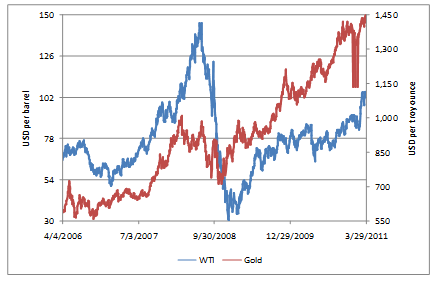
You could look at raw data graphs such as the spot price graphs below for WTI Crude Oil and Gold
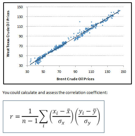
You could construct scatter plots and draw trend lines or lines of best fit for assessing the magnitude and direction of the measure. For example, the scatter plot of Brent Crude Oil prices against West Texas Crude Oil Prices:
You could calculate and assess the correlation coefficient:
And then use rules of thumb to interpret and evaluate the degree, i.e. magnitude of the relationship. You could also assess, given the data set and test parameters used, whether the value of the correlation coefficient obtained is statistically significant or whether there is no proof of correlation between the two variables.
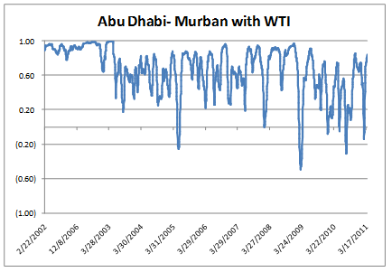
To view how correlations change over time and to assess the stability (or lack of) of their values you could graph trailing correlations such as the one constructed for correlations between Abu Dhabi’s Murban spot prices against WTI spot prices:
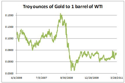
Or you could assess one set of data relative to another set of data. For example, we can assess the relative cheapness of gold against crude oil by constructing the following relative price graph:
In subsequent posts, we will look at each of these ways of viewing correlation in greater depth. We will look at price graphs and volatility trend lines and show how results may be misinterpreted. We will show how scatter plots are constructed on EXCEL; how form, strength, direction and outliers can be assessed from these plots; its relation to the correlation coefficient. We will see how the correlation coefficient and the correlation matrix may be calculated in EXCEL; how the numbers may be interpreted as well as the statistical significance of the results; why it is necessary to track these values over time. In this course we will also cover the graphical way of how to track correlations over time, i.e. we show how the graph of trailing correlations may be constructed on EXCEL. Lastly, we will look at how relative price graphs may be constructed; how these graphs may be used to assess relative value, changing relationships as well as mispricing opportunities.
Comments are closed.