Selling Financial Training on Smartphones to Smart People
You have all seen the new design changes at FinanceTrainingCourse.com. The most recent round took 4 weeks to implement once we decided to go with the combined new look. While we retained bulk of the design from our landing page, the inside page is now a completely different story. Both in terms of speed, presentation and responsiveness. The new site is readable fast on smartphones and tablet and ties in with our goal of pushing financial training on smartphone and tablets.

The previous set of changes were based on more than 12 month of usability feedback from our users as well as Google Analytics and took over seven months to implement. I thought it would be useful and instructive to see how the evolution occurred over time and what really drove our thought process for each of the iterations.
Timeline Zero, Release 4.x – The Latest in Instructional Design – Smart Finance Training Users and Google Search come together
May 2012
Since December we had been debating about the one thing we could do to make life easier for our customers – users of free as well as paid training. While Google Search did a reasonable job of indexing our content and giving us traffic, we had felt for a really long time that site navigation once a user landed on any of its inside content pages through Search was confusing. It was difficult to find related content and even more difficult to buy related finance topic specific pdf and ebook files, excel downloads and video courses.
While the realization that this was missing came early, the design took four iterations before we got it right. It was a mix of user driven insight, getting a great graphic designer on board and consistent questioning by the team that runs product development internally. The questions they kept on asking were:
What do we really stand for? What are we really selling? Who is buying this content? Till we figured out the answer to these questions our design was all over the place.
Once we realized that we had great financial training content, a lot of it for free, almost all of it organic and respectably rated, it made thinking about design easier. Whatever design we did had to flow around our content.
We also agreed that what we were really selling were models and practical hands on advice on building great financial models. This understanding also came after years of experimenting with what we really stood for. The solution we were selling was in many ways a commercial edition of Wikipedia for financial models – except that rather than just limiting ourselves to text we were doing video lessons, excel models that you could download and follow at home and study guides that provided a step by step walkthrough of putting together exotic and exotics sounding excel spreadsheets.
When we dug a little deeper we found that the customers who were buying our content were all smart and sophisticated financial users who were already aware of what was available on the internet when it came to hardcore finance and what was missing. All we had to do to make it work was to build an interface that allowed them to find what they really needed on the page they landed from Google.
What were the results?
For starters, once the new design was rolled out in May 2012, the more striking and immediate result was a unheard of improvement (shrinkage) in our bounce rate. Our historical two year average has been 65%. The lowest bounce rate that we had seen had been in the high 50s. The highest that we had seen was in low 80s.
Four weeks after the launch of the new design, guess where our average monthly bounce rate stands?
Around 9%.
What does the most recent weekly average bounce rate looks like?
Under 5%.
Why is this relevant and why should you care? Side by the side with the low bounce rate, came a 150% increase in page views per visit and a similar increase in time spent on site. Sales that had collapsed with traffic and an earlier mistake with hosting in March 2012, bounced back and beyond their all time high within two weeks of the new redesign launch in May 2012.
Timeline Zero – 1, Release 3.x – Experimenting with groups, buddy press, social media and stickiness
December 2011
Great design and results never happen with a single shot. In most cases they are refined by errors and mistakes. Mistakes eliminate faulty assumptions that are holding you back from breaking out. It helps if your cost structure and capital base is such that you can afford to make a handful of mistakes before running out of capital and killing yourself.
In December 2011 we made an assumption. The assumption was that to increase stickiness at the site we needed to add functionality that supported social media features, groups and forums to our design. This required a shift from our simple WordPress site to a Buddypress supported site. While the assumption about adding new functionality for stickiness was correct, there was a fatal flaw in the underlying analysis.
“Just adding functionality is not enough, you have to seed content and users in a forum before the forum picks up mass and life.”
Till that happens it is just a good looking (at times) expensive dead zone.
Seeding a Forum or user group or a Q&A site is difficult. Quora is worth what it is today because it is difficult. While functionality can be tapped from any open source or vendor supported code base, content, users and interaction cannot be faked and can only be built over time. And while you are waiting for the bandwidth consumption to hit its tipping point, CPU cycles required to support the new functionality require you to move to expensive, higher end server hosting options. Forums, Groups, Topics and pure Q&S sites tend to be PhP heavy (read: CPU heavy).
Despite all the problems and issues that plagued Release 3.x, it was still a big step forward for us. For the first time, we had a full time resource dedicated to managing and growing the site. And while the initial kick was not as good as expected, traffic still picked up and the site zoomed in the first few months across search ranking, traffic and page views. All of this was before it started killing servers across every single host that we tried to work with.
We finally decided to kill Buddypress, groups and forum functionality to retain our sanity and stop the midnight calls from our hosting service provider about exceeding server CPU cycles. A week later the latest of our server hosting vendors went under and never really came back.
Timeline Zero – 2, Release 2.x – Topic specific treasury and risk guide for Institutional Customers
October 2010
Somewhere in between the many experiments, we decided to do a completely advertisement free site aimed at Corporate Customers. An e-learning solution aimed at treasury and risk specific domain users who were looking at a one stop intelligent solution that did not require a few million US dollars in change.
The Learning Portal was a first attempt that ultimately grew into the Financial Learning Network Subscription Offering. While it was amazingly successful in initial client and beta testing it had a different kind of issue. We simply couldn’t give it away to customers for a trial period. Hence the need for a free trial site and customer testing.
A year and change later the work we had done here and what we learnt later, led to our final design of training landing pages and their usage at the new site.
Timeline Zero – 3, Release 1.x – Topic specific treasury and risk guide for Institutional Customers
September 2010
Our first major redesign after the site was launched in February 2010. It was a refinement of our initial attempt to chase page views and Adsense dollars. We also introduced our store, added support for viewing via a handphone or mobile and started pushing our organic content more aggressively.
The WordPress theme that we picked did all the work for us so from a support point of view there wasn’t much effort. Except when the theme broke and the site went from being functional to the stone age.
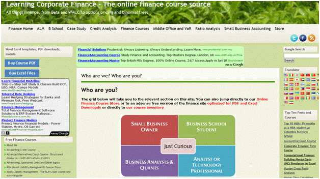
But despite the advantages of WordPress, you still couldn’t hide the fact that under all those pages it was a decade old model. Adsense advertising and a more or less static positioning we had started off with ten years earlier. Our original assumption was that based on the content we had there were four possible segments that we were chasing. Regulators, Bankers, Business School Students and Small Business Owners.
It took us the next two year to realize that the design that we needed and wanted wasn’t a segment driven site (Regulators, Bankers, Business School Students, Small Business Owners). Rather than Who you are and what do you need, the design that finally worked in June 2012 was more of a “Here is a lot of content that is easy to navigate and you are smart enough to figure out all the rest. Just like Wikipedia.”
The other bit that became apparent when customers started buying our financial content was that of the three segments only one was willing to spend money on the positioning we had used. The rest either didn’t have the budget, didn’t have the right motivation or didn’t feel the need as bad as we originally thought.
It is apparent now that because of all the above shortfalls, user feedback sucked. But we didn’t listen to it simply because we didn’t have enough data nor the right resources to fix it.
The site had too much clutter and confusion but still generated traffic, cash and numbers.