In the summer of 1998, the year that saw Long Term Capital Management implode, I interviewed with Goldman Sachs London office for a Fall Associate position. Across two days of interviews I was asked questions by members of different desks. Some I was prepared for. Some I figured out in real time. One completely floored me. The reason why this memory is so sharp is because I had been taking actuarial exams and mathematical statistics was a strong point. I didn’t expect to miss anything in that space. Answering Goldman interview questions took preparation. This specific question covered a topic I had reviewed many times as part of my actuarial exams but had never really used at work. I drew a blank. What is the third moment? I knew it, it was a familiar concept, but that morning in London, completely out of my reach
What is a moment generating function? What does it represent? How would you explain the third moment to your grand mother?
Twenty three years later I finally take a shot at answering it. Take a look. It just might get you that offer.
The Goldman Sachs question that floored me 23 years ago
Let’s say you are modeling Bitcoin prices. You want to get a better sense of how much prices can move in a given day. You have the price series. You calculate daily price changes. You plot both as a chart.
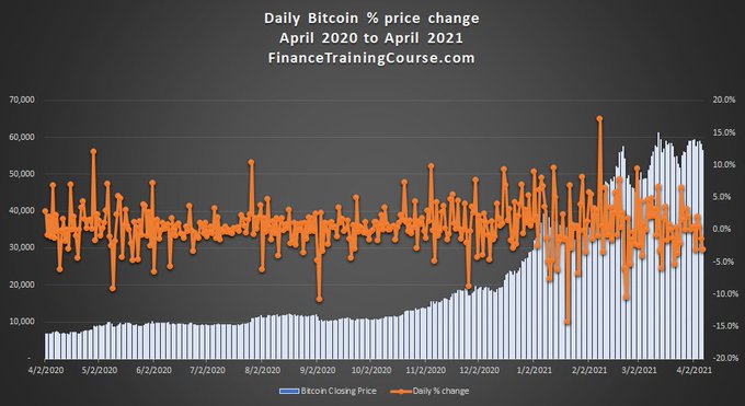
It is a good first step, better than raw data but you can do better than this. You use the Excel function to organize daily price changes into something more meaningful. You organize, bucket and plot the daily price change frequency and end up with a histogram. A histogram is useful tool that gives you an immediate sense of the underlying distribution.
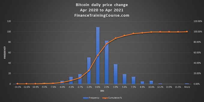
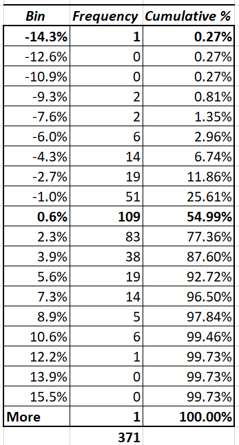
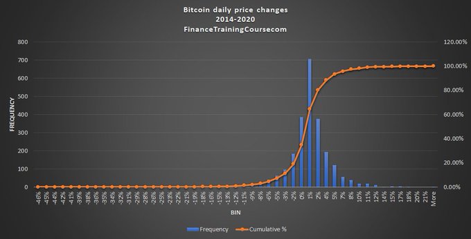
You now have a range for the most common change (between -1% and 2.6%) and the extreme changes (-14% and 15.5%). Where does the histogram come from? The histogram is a plot of the table shown below. A ordered tabulation of the price change series that you had calculated above. The both describe the statistical distribution.
Do you think its symmetrical or asymmetrical? Left leaning or right leaning? Thin tailed or fat tailed? Why does that matter? This is just one year of data. Would the shape change if we added more data? Think about these questions before you read forward.
Here is the same distribution with 7 years of daily price change data. Do they look like? Or different? Can you describe the shape of statistical distribution by looking at parameters rather than 7 years of data?

Enter moments of distribution.
If you have done high school statistics, you already know the first two. Mean and variance. The first defines how and where the distribution is centered. The second how widely dispersed values are within it. Standard dev = sqrt(variance)
When you put the two distribution from above side by side what do you see? What is the difference between the two?

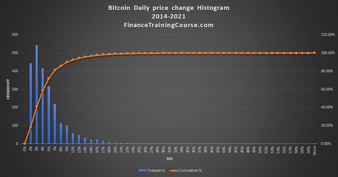
The smaller data set (12 months) is more centered than the bigger data set (84 months). You can see that the for the 2nd data the right tail is longer than the left. Can you tell me why is that?
There was an embedded trap above, did you manage to catch it?

Here is the thing about data. You should never take anything at face value. I said it was daily price changes and we accepted it as such. It’s not. The negative price changes disappearance should have given the game away. It is actually a plot of daily range as a % of the closing price for the day. It’s not really price change.
In financial markets security or asset prices are often skewed. One tail may be longer than the other depending on which direction the security has been trading. Up or down. Skewness is the third moment. If positive skewed to the right. If negative skewed to the left.
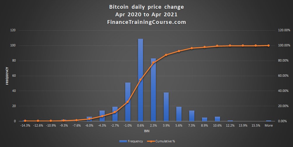
Of the two graphs above the centered one has a slight skew and a skew value of 0.2. The 2nd one is clearly skewed to the right and has a skew value of 3.1
Here is the actual 7 year price change distribution. Notice anything different? Skewed to the left or right? What do you think is the skew value in Excel for the underlying dataset
It is -0.86. Compared to 3.1 for the price range histogram and the 0.2 for the 1 year price change histogram. What does that mean? Skewed to the left or right? Which tail is longer?
Here are the three graphs again. In a single accessible panel. So you can see them together again.
Last 12 month skewed to the right. Last 7 years skewed to the left. Last 12 months price range went up more than it went down. Last 7 years price went down more than it went up.


When it comes to asset return distributions which one would you prefer? Quickly now. No peeking.
One skewed to the right or one skewed to the left? Which one is better?
That is the clumsy, long drawn explanation. Not worthy of a @goldman interview. Now explain all of this to your grandmother in less than 90 seconds.
For historical record the actual interview question was: What is a moment generating function? What is the third moment of a distribution? How would you explain it to your grandmother?
The gentleman who asked me this question worked on one of the option trading desks. Skewness is important in the trading world because it gives us a a historical sense of how much the distribution of price changes are likely to diverge from the model.
In the option world our pricing models assume prices follow a log-normal distribution but returns (price changes) follow a normal distribution. If we know the underlying distribution is skewed, we know options are mispriced. Markets ultimately correct mispricing.
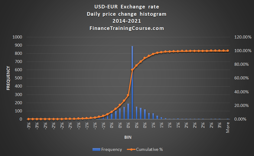
Mispricing represent trading opportunities. At simplest level understanding skewness allows you to identify and take advantage of market mispricing. Some distributions are more skewed than others. For instance the USD-EUR Exchange rate compared to Bitcoin price changes

If underlying option pricing model follows standard assumptions, which one of these represents a bigger mispricing opportunity? Imagine complexity of options world. Mix that with Bitcoin. Now imagine options on Bitcoins. Confusion and mispricing galore.
This become even more important when you become an option market maker, when you write options for premium income. If you don’t understand the distribution and elements of mispricing, you will bleed capital all the way to insolvency.
Because I wasn’t able to answer the question, I wasn’t qualified enough, I didn’t have the depth required to work with the option traders. It would be take another 10 years for me to lose my shirt trading options on crude oil to understand that.
If you want to be a trader you need to understand the underlying, distribution of price changes and how it deviates from standard assumptions. Moments of a distribution give you sense of how unlike “normal” a distribution is. Mispricing and trading is a function of that answer.
While statistics is taught in high school, college and actuarial exams, application of these principles is not covered anywhere. That you pick up in the trenches. I had expressed an interest in trading options. The 3rd moment question was a filter.
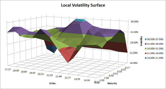
If I had been trading options seriously or actively following traders, I would have know the answer. I would have also known about implied volatility and the concept of volatility smiles. Which would have been the next question if I had answered the first one correctly.
Look up plot of implied volatilities against strike prices and maturity, especially deep out of money options. Writers adjust implied volatility to charge for covering risk of mispricing. Meet volatility surfaces. Not a single estimate for vol. But a surface. Next question?
Cryptocurrency options will be the true wild west of financial market. Fortunes will be made and lost in that space on a daily basis. It is the move that will follow big players offering clients exposure to crypto assets. 23 years later the question is, when it happens will you be ready for it as a trader? How would trading crypto options be different from trading regular options?