Better Excel Charts
About the Course
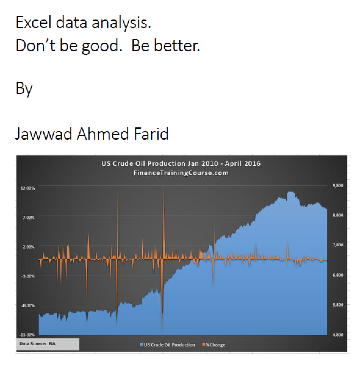
The courses aims to provide analysts with tools to add impact and clarity to presentations and reports. It consists of two parts. Book one focuses on creating better charts in EXCEL. Book two looks at building data tables in EXCEL for sensitivity testing and storing extrapolated results.
Both parts use real life data to illustrate the processes - oil rig productivity in the US is used to demonstrate how to build effective charts, while the data for testing a financial model for a startup is used in setting up data tables in EXCEL to evaluate trends, patterns and sensitivities.
Learning Objectives
After taking this course you will be able to:
- Identify the common themes in creating plots/ charts/ graphs
- List the eight key lessons/ takeaways of this course
- Understand the process for forming opinions, obtaining data and analysis and building a story/ case that you want your chart to show
- Assess the incremental value of adding, removing and adjusting elements in your EXCEL charts based on the message that you want to convey
- Choose the appropriate measure to evaluate the relationship between two or more variables without forgoing clarity
- Recognize the core drivers & outputs of your EXCEL model
- Build a model where the core drivers are the variables in the model and the outputs are functions of these drivers
- Create data tables to sensitivity test your model for varying combinations of the identified core drivers and store results.
Prerequisites
The candidate should be comfortable with basic mathematics, statistics and EXCEL.
Target Audience
For new analysts, to avoid some common mistakes made when using EXCEL charts and to improve and refine their presentation and analytical skills set.

