A scatter plot is a visual representation of the correlation between two items. It ties in with the correlation coefficient as it is used for indicating whether a linear relationship exists or not between two variables. The plots are also used to assess:
- The functional form of the relationship
- The strength of the relationship
- The direction of the relationship
- If there any outliers in the dataset being studied
Before going into each of these four uses of the scatter plot let us first see how it may be constructed in EXCEL and what the data points in the resulting plot tell us. In addition, we will also see how a line of best fit may be constructed for the given plot. This line of best fit is used in assessing, in particular, the strength and direction of the relationship between two variables.
To construct a scatter plot we need to first obtain the historical time series data for the variables, in this case, the West Texas Crude Oil and Brent Crude Oil spot price data time series. To ensure the quality of the analysis it is important that data used in the study is obtained from reliable sources- always remember the old computer adage “Garbage in, garbage out”.
Next using EXCEL’s chart function we construct scatter plots from the two time series obtained (i.e. Insert Tab> Charts> Scatter Plots)
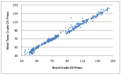
This results in the following graph:
A data point on the graph shows how the USD x spot price for 1 barrel of Brent corresponds with the USD y spot price for 1 barrel of West Texas on any given day.
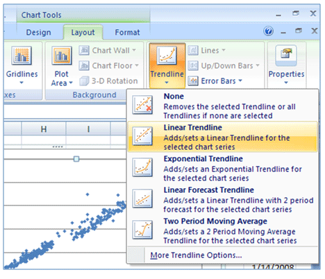
As mentioned earlier a line of best fit is usually added to a scatter plot in order to better assess the strength and direction of the relationship between variables. This may be done in EXCEL by adding a trend line to the graph. Click on the graph and select the “Layout” tab from “Chart Tools”. Click on the drop down menu for “Trendline” and select “Linear Trendline”.
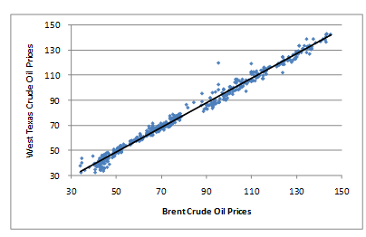
The resulting trend line on the scatter plot will be as follows:
Uses of the Scatter Plots
Functional Form
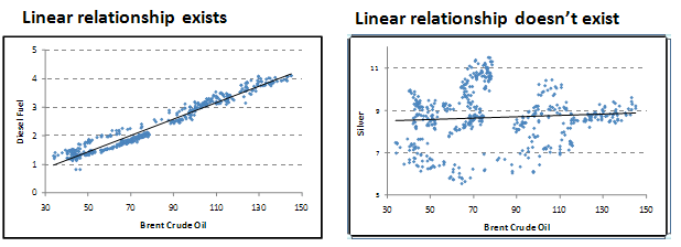
The way the data points lie in the scatter plot tells us of the functional form of the relationship, i.e. whether a linear relationship exists or not between the two variables.
Strength of Relationship
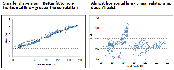
A line of best fit is used in the scatter plot to assess the strength or weakness of a linear relationship. To determine how strong the relationship is, we will see how closely a non-horizontal straight line fits the data points of the scatter plot. The greater the dispersion of data points in the plot around the line of best fit the weaker is the correlation between these two variables. A horizontal line of best fit indicates that there is no linear relationship between the two variables.
Direction of Relationship
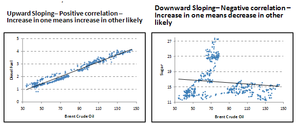
Do the data points on the scatter plot or alternatively the line of best fit slope upwards or downwards? A line sloping upwards from left to right represents positive correlation, i.e. it suggests that as one variable increases the other variable tends to increase as well. A downward sloping line from left to right indicates that there is a negative correlation.
Outliers

These are individual values that fall outside the overall pattern of the relationship and could lead to over- or under-inflated correlation values. They may be due to errors or anomalies or exceptions in the data. Usually, they would need to be excluded in order to obtain a better assessment of the correlation between the variables.
The scatter plot ever video is an eye opneer. I could only imagine something like that during my college years and now I am amazed of the wonders of technology. The data that this interactive graphs can actually emphasize the importance of the change of times. We can observe these changes by analyzing the four graphs were asked to view. For example the mobility graph that has various variables that can affect a country’s economic growth or change in the social standards according to their wealth is interesting. I can agree to it because my parents did not received an education and their income was at a low level close to poverty. Now their children including me have received at least a 4 year college degree we can say we have moved the ladder to the middle or upper middle class and our children who earned a college degree have found themselves starting at the upper middle class and in a bigger city where the more opportunities are found for a better pay job. The second interactive graph about the jobless rates can also determine how fast a country can overcome the recession. The presidential Approval tracker data is also very informative I shared this information with the social studies teacher who at the time shared with her students. Students observe how the president’s approval has changed as time changed. Students were asked if they could observe a pattern that affected a president’s opportunity to be re-elected.