We take a quick look at plotting data and price series in EXCEL for correlation analysis and presentation. The plot lesson is different from the actual correlation calculation lesson which we cover separately in another post.
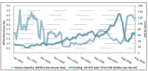
A graphical representation of data over time provides important insights into the reaction of particular variable to changing market conditions. However, comparing two sets of seemingly related data can provide us with additional insight. For example, to assess the crude oil price, look at what the numbers of excess capacity are like during the analysis period.
Graphing the data series for the correlation analysis
In order to construct such a graph, we need to first obtain the historical time series data for the variables. In this case, the WTI spot price data time series and the excess capacity of crude (million barrels per day) time series. To ensure the quality of the correlation analysis it is important to obtain data for the study from reliable sources. Always remember the old computer adage “Garbage in, garbage out”.
Next, using EXCEL’s chart function we construct line graphs from the two time series obtained.
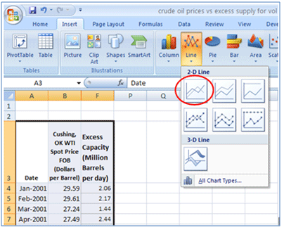
Excess capacity is expressed in million barrels per day. WTI spot prices are expressed as USD per barrel. Note the scale for these two time series differs considerably. It is, therefore, necessary to use a separate vertical axis for each time series. This ensures a more suitable comparative perspective. We achieve this by first selecting a line graph (in this case WTI prices). Then, choosing to “Format Data Series” and selecting to plot the series on the “Secondary Axis”:
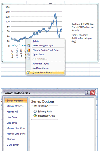
The resulting graph is our first graph (after making additional minor formatting adjustments- legend, labeling, etc). We reproduce this graph below once again with the addition of some circled off areas:
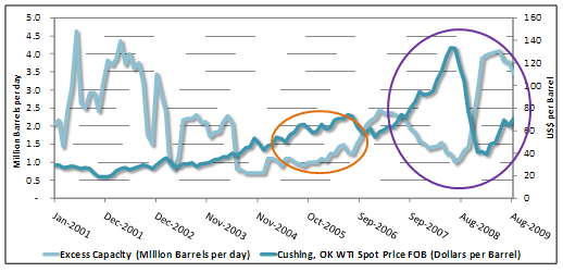
Assessing the correlation plot
To assess the relationship between excess capacity and the WTI spot price we eyeball the trends that the line graphs are showing in relation to each other.
For example, in the period between September 2007 – August 2009 (purple circle) there appears to be a significant negative correlation between excess capacity and WTI spot prices. When excess capacity was declining, WTI prices were rising. By contrast, the period between November 2004-September 2006 (orange circle) we see that both graphs have an upward trend. As excess capacity was rising so were WTI prices.
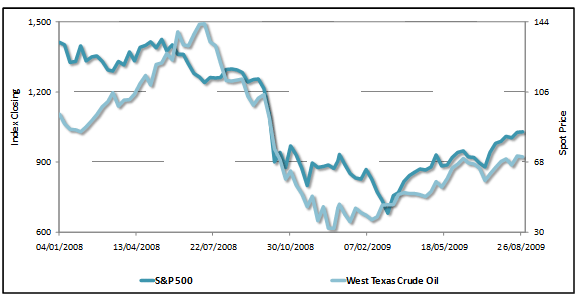
This changing relationship between variables can be misleading. Consider the relationship between West Texas Crude Oil and the S&P 500 index in the period January 2008 to August 2009.
We see that the two data series track each other closely over this period. There is a strong positive correlation. As the Crude prices rose (fell) it was highly likely that we would see the S&P 500 rising (falling) too. This may lead to false assurance that the trend in West Texas Crude is a very good proxy to the trend in the S&P 500. However, if we look at the trend over a wider window length, say from January 2001 onwards we can see how reliable or feasible such an assumption would be:
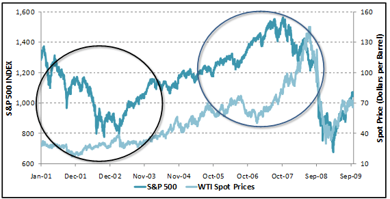
Over a longer historical time horizon, the correlation between these two data time series has not been as stable or as positively correlated as the shorter time horizon suggests. In fact there are periods (circled) when WTI and S&P 500 have experienced marked negative correlation.
Other graphs and trends
We do not have to limit our correlation analysis to raw data time series such as price and indices data, and fundamentals such as demand and supply data or excess capacity data. We can extend our correlation analysis of market variables to derived data such as volatilities, returns, etc. For example, the graph below plots trend lines for volatility experienced in Telecommunication stock prices in Pakistan.
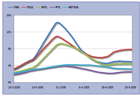
We discuss the calculation of trend line volatility in the Market Risk Metric post on volatility trend analysis. For now, it is sufficient to know that an upward sloping trend line indicates that average volatility, and hence riskiness of the stock as assessed by stock price movements, is increasing; a horizontal line shows stable volatility levels, whereas a downward sloping trend line shows declining volatilities and riskiness. A comparison of these 5 telecommunication stocks shows that in general, all stock volatilities have followed a similar trend over the study period however with different intensities. TRG, TELE and WTL track each other closely whereas their relationship with PTC and NETSOL volatility is less strong.