Four scenarios to set things right.
We go back to a simple world where implied volatility can take four possible values. 10%, 20%, 30% and 40%. As a trading desk we can write and sell options at each of these implied volatility levels. We decide to write a call option. Here are the simulation results for premium, P&L, Trading Gain/Loss, Interest Paid and Principal repaid for the four scenarios.

Figure 1 Implied volatility scenario one
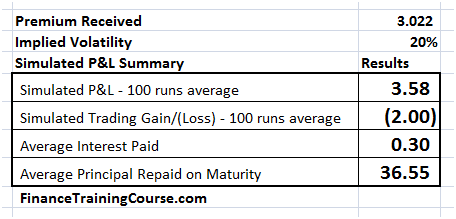
Figure 2 Implied volatility scenario two
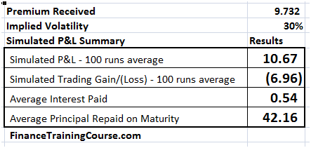
Figure 3 Implied volatility scenario three
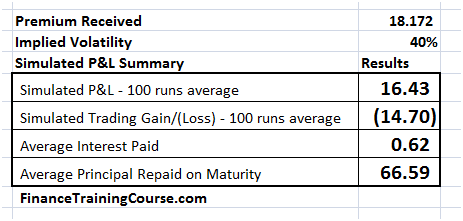
Figure 4 Implied volatility scenario four
As a trading desk your best case is a combination where you write an option at 40% implied volatility and book a premium of 16.43. The next day or a week late when volatility falls to 10%, you square yourself in the market at a cost of 7 cents and book a profit of $16.36.
Your worst case is writing an option at 10% and seeing implied volatility levels rise to 40%. Premium income limited to 7 cents and hedging costs rising all the way up to 16 dollars.
But the tabular scenarios presented above do not do justice to the case. To truly appreciate the depth of our pay off (in the first case) or your misery (in the second) it is just as important to plot the P&L distribution for the four implied volatility scenarios. We do that next.
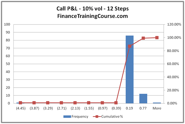
Figure 5 The distribution of P&L for 10% volatility
The P&L distribution shows that while the average cost of hedging (premium) may be 7 cents, it can cross 77 cents in extreme scenarios for the 10% volatility case.
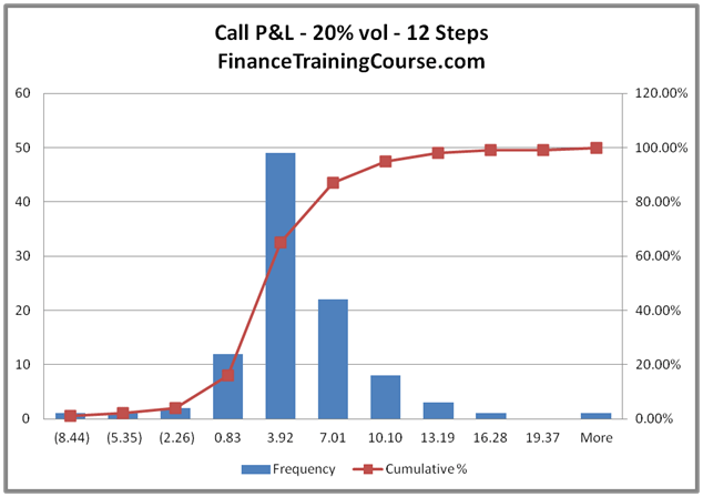
Figure 6 The distribution of P&L for 20% volatility
The extreme for 20% vol is 19 dollars and change; for 30% vol 26 dollars and further north of 26 dollars for the 40% volatility case.
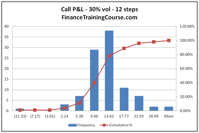
Figure 7 The distribution of P&L for 30% volatility
But these are absolute numbers and they do not give a true sense of how extreme these numbers can be unless we plot the relative distribution. The P&L relative to the premium received.
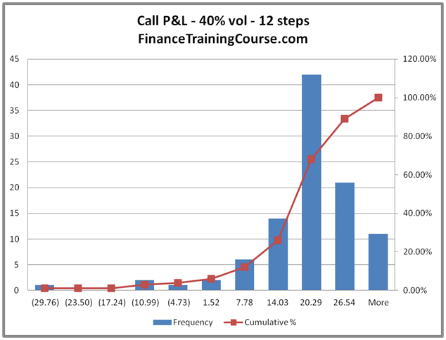
Figure 8 The distribution of P&L for 40% volatility
To calculate the relative P&L we divide the absolute P&L figure by the premium and then use EXCEL to draw a histogram for the series. The results for the four scenarios are presented below.
Relative P&L Comparison
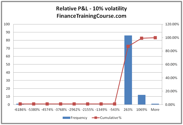
Figure 9 P&L relative to premium at 10%
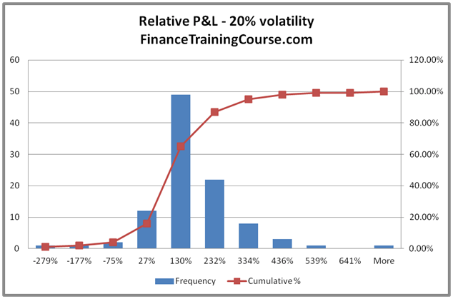
Figure 10 P&L relative to premium at 20%
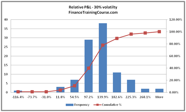
Figure 11 P&L relative to premium at 30%
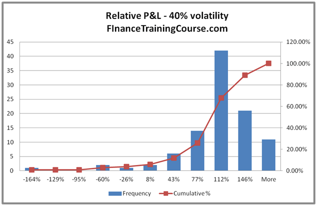
Figure 12 P&L relative to premium at 10%
No it is not your imagination. There is a definite trend here. Something is happening to the relative P&L distribution. As we raise volatility, the P&L distribution is stabilizing. A large part of that stability has to do with the fact that premiums are rising and with that increase the magnitude of extreme swings in relative P&L is reducing.
We use two more plots (the last two, we promise) to make the point clear. The first plot, show relative volatility for the 20%, 30% and 40% scenarios. The second plot includes the 10% scenario.
We won’t comment on the trend. You be the judge.
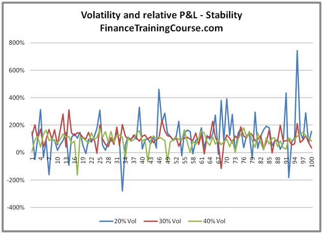
Figure 13 Relative P&L plot for 20%, 30%, 40% scenarios
A quick question before we end this chapter. In your opinion what do these two charts imply for supply and demand curves for option writers? How do you compare the curves when implied volatility levels are low versus instances when implied volatilities levels are at historical high?
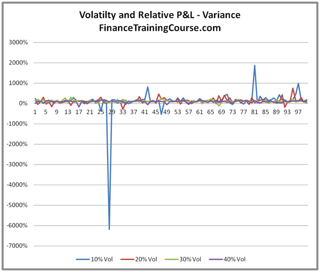
Figure 14 Relative P&L plot for 10%, 20%, 30%, 40% implied vol scenarios
More vexing questions on hedging P&L
For your P&L simulation or actual hedging implementation which Delta should you use? One calculated using the implied volatility or one calculated using your expectation of future realized volatility? How frequently should you update that Delta estimate? Would you favor a crude Delta hedge over a Delta Gamma hedge or an even more sophisticated Delta Vega hedge? There is some fascinating research on the topic by Riaz and Wilmott and a number of other authors that we will try and review in our next post. Stay tuned to the Delta hedging channel.