The shape and direction of interest rate yield curves project information about market expectations, trader sentiments, outlook and guidance for coming quarters. Expectations and sentiments can change at a whim on release of new data or a shift in economic cycles. Making good calls on where interest rates are heading requires us to understand how historic yield curves have behaved in the past. Their shape and their transition from one interest rate environment to the next before the end or beginning of the next economic cycle is often used as a leading indicator.
If you are interviewing for a role on a trading desk, a quantitative hedge fund or roles associated with trading fixed income or equities on Wall Street, you are expected to know background, current context and have an opinion and a trade ready for pitching to a client. Read the following note with that view. Where is the trade? What is your view? How sure are you of your facts? How far will you go to back your bets? What is the background supporting data suggesting?
The years 2016 to 2019 provide a fascinating look at three major transitions in historic yield curves for students of interest rates and economic cycles. A shift from quantitative easing to tightening (rise in policy and interest rates) that was long anticipated but took its time. An expected tightening that didn’t run its anticipated full course and finally earlier than expected rate cuts. Flattening, inversion and recessionary fears, all within a span of four short years. After years of living and trading in a quantitative easing environment, this was more action we had seen in a decade.
In a prior post on US Treasury yield curve history, we looked at the shape, slope and movement of US Treasury yield curves for the period 1978 to 2014. We update our review on historic yield curves for the period 2013-2019. 2013 and 2014 to provide context to the transition in yield curves and 2016 to 2019 for a review of the actual shifts. Take a look at the original post to get more background and data on treasury curves historical behavior going back to 1978.
The question we want to ask and answer using the analysis that follows is simple.
Do historical yield curves indicate the possibility of an upcoming recession and slowdown in the US economy? Do we have any additional supporting data points? Have there been instances where the curves and their predictions were wrong?
Let’s take a look.
US Treasury yield curve history – Flattening, Inversion and Recession Fears
We start with a full frame view that puts historical yield curves data for our review period in one simple visual presentation. The graph below shows historic daily US Treasury yield curve from January 2013 to early November 2019. The three axes describe interest rates (vertical – y), dates (horizontal – x) and tenors or maturities (depth – z).
We can clearly see ripples of movement beginning to hit short end (short term rates) of the curve in late 2015, followed by a slow and gradual rise in rates till the last quarter of 2018. In the same frame, we can also see movement in the long end (long term rates) of the curve on the other side.
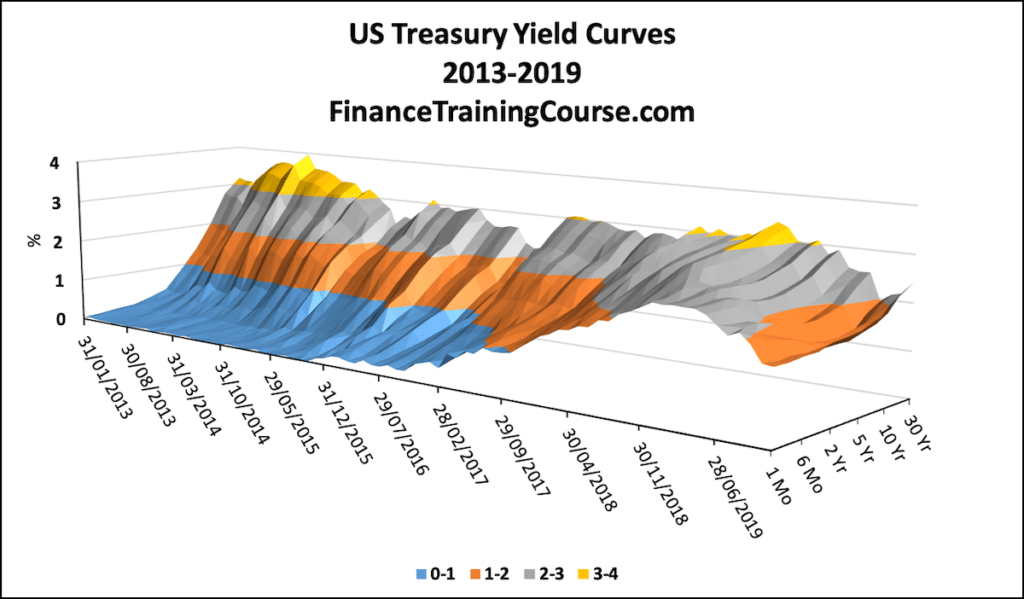
The funneling effect that we see as we move from left to right shows the curves transition from a steepening one to a flattening one and finally to an inverted curve by August 2019. To see the impact we plot four tenors – 3 months, 2 years, 10 years and 30 Years in the graph below:
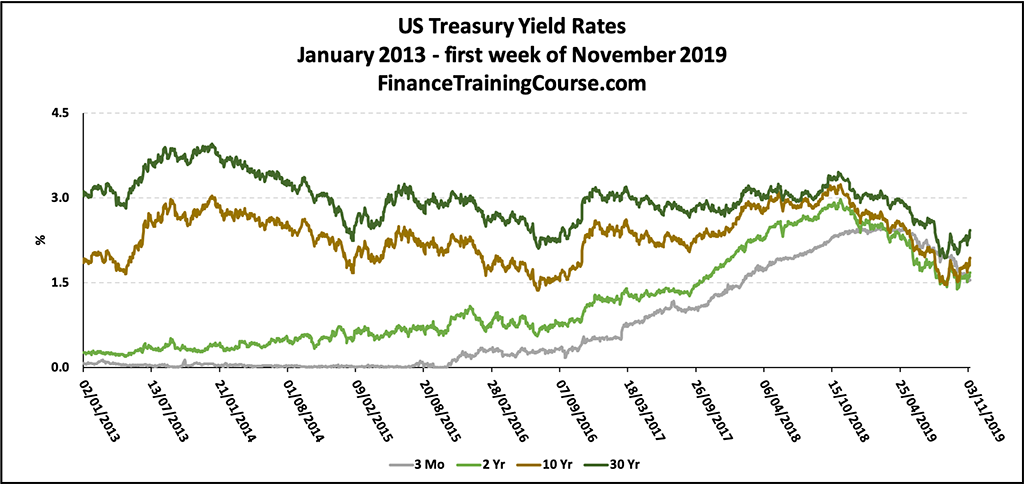
The vertical axis shows interest rates while the horizontal shows dates. The four plots show interest rates for 3 month (short end), 2 years (intermediate) and 10 and 30 years (long end of the curve. We can see how the two ends begin to converge starting 2017, merge and then move together in 2019.
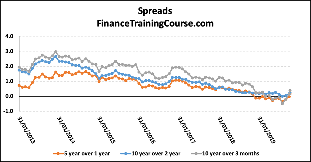
A third view of the same data set narrows down further to plotting interest rate spreads – the difference between two given rates. The image below shows the decline of spreads between the short rate – 3 months and long end -10 years as well as between intermediate rates – 2 years and long end – 10 years from 2013 to 2019.
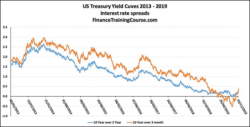
The steepening (an increase in the spread between short and long end) of the curve reached its peak in last quarter of 2013 with 400 basis point spread between 30 year rate and 3 month rate. Since then the spread between short term interest rates and long terms interest rates began a slow and gradual drift to lower levels.
Short term rates (as depicted by 3 month rate) increased by 150 basis points from January 2013 to November 2019, reaching a total shift of 250 basis points in March 2019. Long term rates (given by the 30 year rate) declined by 50 basis from January 2013, or 150 basis points, from their December 2013 high. The result has been a flat yield curve with inversion (short term rates higher than long term rates) occurring from August 2019 to October 2019. During this period 10 year rate was lower than 3 month rate.
The transition of historic yield curves over this review period can be seen in the set of plots below.
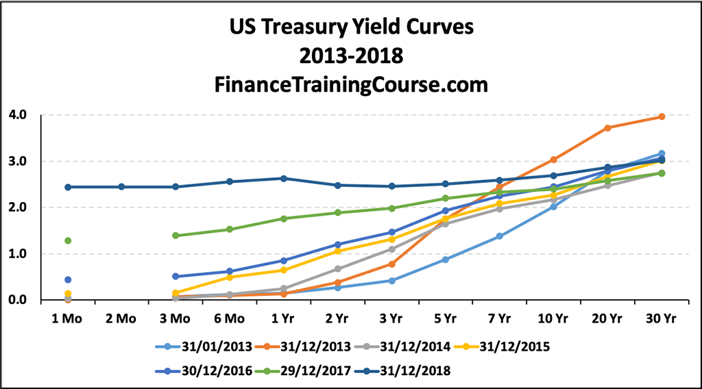
Increase in short term rates as Federal Reserve increased policy rates nine times starting December 2015 shifting from 0.25% to 2.50% by December 2018.
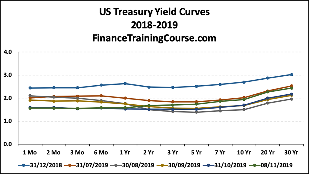
Then a decline in rates as the policy rates were cut; to 2.25% in July 2019, 2.00% in September 2019 and finally 1.75% in October 2019.
Recession on the cards?
Policy rate cuts are often used to soften the blow on economic growth by making it easier for the economy to attempt a soft landing. The decline in long term rates and a flattening of the yield curve, where we see lower spreads between short term and long term rates, is often taken as an indication of lower future anticipated growth. A flattening of the curve followed by an inversion of the curve often points to a slow down and a future recession.
Inversion seen in the yield curve at the tail end of August 2019 indicates investors willing to leave assets tied up in longer term lower yielding securities because of uncertainty and expectations of future rate cuts on account of a difficult economic environment. As rates head south, bond prices head north. From a capital gains point of view, long duration bonds such as 30 year treasury bond are likely to gain the most in value as rates adjust to lower levels.
At the end of August 2019, 3 month rate exceeded both 10 year and 30 year rates while 2 year rate exceeded 10 year rate, with the 30 year rate falling below 2% for the first time in history. The negative spread between the 10 year and 3 month rates persisted for 56 consecutive days from end July 2019 to the second week of October 2019.
An inverted yield curve and negative spreads between 10 year and 3 month rates, are often used as a leading predictors of a recession. In August 2019, the probability of a recession within one year was assessed by the Federal Reserve Bank of Cleveland as 44.1%. As of October 2019 it stood at 31%.
Real GDP growth history
Outside of interest rates and historic yield curves, do we have any additional data points that support the “a recession is coming” view?
Here is another data point and view of 10 year – 3 month spread plotted against real GDP growth in US economy. Negative spreads have preceded periods of negative real GDP growth. The spreads have been useful in indicating if growth will exceed or fall below average in coming 3 to 4 quarters:
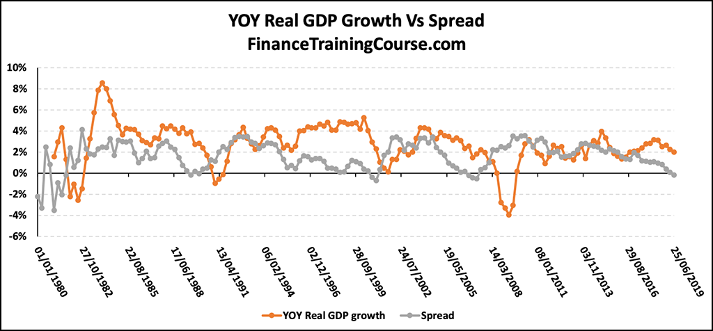
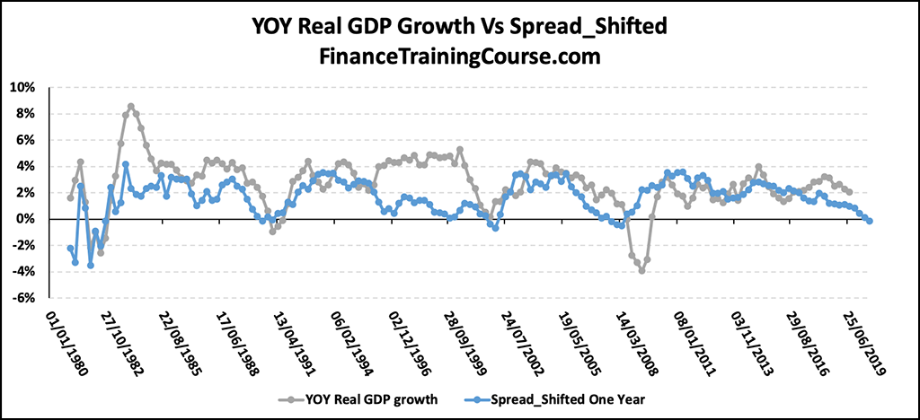
Their usefulness is more apparent if the spreads are shifted to the right by a year. As can be seen in the adjusted graph below they remain an important signaling measure for future economic activity including predicting recessions.
Federal Funds Rate
A third indicator or predictor quoted in literature is how federal funds rate fare with respect to long run average. Alternatively, incorporating information from historic yield curves, spread of 10 year US Treasury bond rate over Fed Funds rates may be assessed. Recessions (blue shaded areas) have been preceded by periods where current Fed rate was lower than long run average or where spreads of 10 year rate over Federal Fund rates were negative:
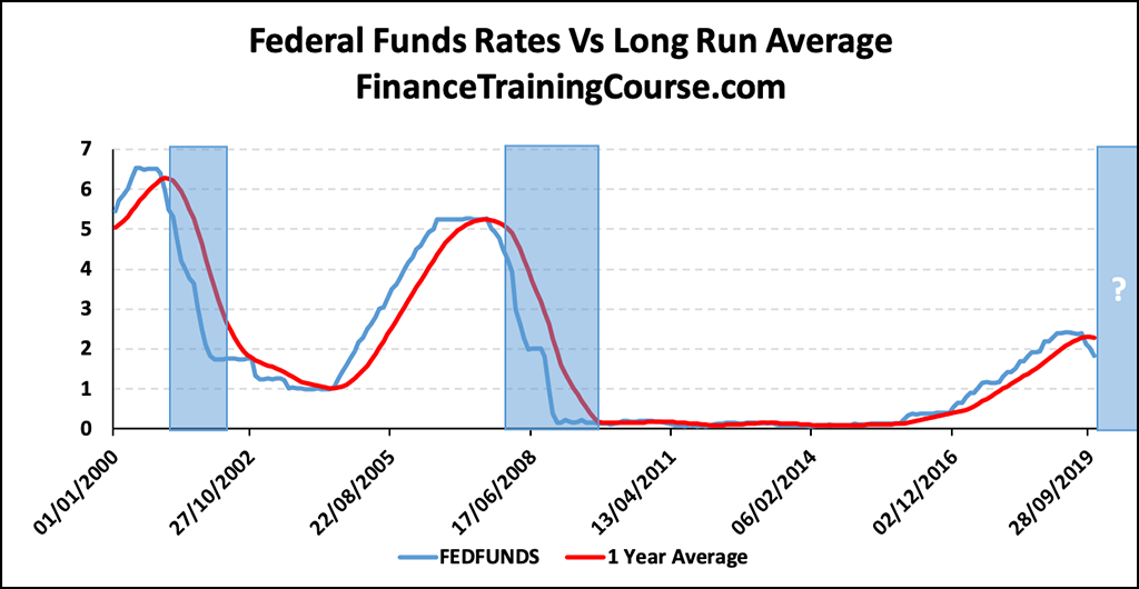
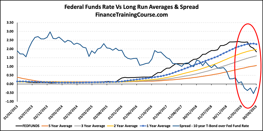
What is the appropriate long run average to assess the current federal funds rate against? While the current rate is less than its one year and two year average in August/ September 2019 this is not the case when it is compared to its 3 or 5 year average. However, negative term spreads for this period seems to suggest the appropriateness of a 1-2 year period for determining the average rates. Future development regarding the direction of the economy will either lend weight or disprove its relevance.
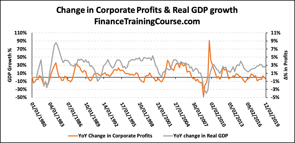
Corporate Profits
A fourth cited leading indicator for economic activity is pre-tax corporate profits. Together with the falling trend of historic yield curves spreads, profits tend to fall prior to recessions. This makes corporate profits a signaling tool for the direction of the economic cycle.
Is the US economy headed towards a significant downturn? Leading indicator and signal number four seems to suggest so.
The data presented on St. Louis Fred website only gives data till the second quarter of 2019, so it would be useful to keep an eye on the trend over the next few quarters.
Alternate explanations for falling interest rates
Could there be external drivers that may be driving a reduction in US rates? Not driven by the dynamics of the US economy but by its global peers. We can think of three. Eurozone interest rates, low inflationary outlook and the US-Chinese trade war.
Negative interest rates: The fall interest rates across tenors may be attributed to negative interest rates/ deposit rates plaguing Eurozone economies. This has sent investors seeking safe haven instruments park assets and excess cash in US Treasuries. US Dollar being the global currency for trade also means that purchasing US Treasuries is a natural choice for many developed economies and oil producing countries. This has led to an increase in demand for US treasuries which pushes up their prices and results in lower yield rates. The increase may have been partially offset by reduction and redemption of Chinese and Russian purchases of the same instruments, but it could be a possible driver that needs additional investigation.
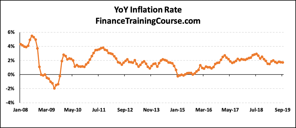
Expectation of low inflation: There remains a low expectation among investors that inflation in the US will increase above 2%. As of October 2019, US Department of Labor published an annual inflation rate of 1.7% for the 12 months ended September 2019. Hence, there remains no immediate inflationary pressure that would lead to higher long term rates. But talks of low inflation are now being overshadowed by imported inflation on account of US economic trade wars with its trading partners. Not just China by the imposition of trade related tariffs on other significant trading partners.
US – China trade war: The US-Chinese trade war has hurt both economies, with each country imposing tariffs and trade barriers on each other’s goods worth billions of dollars. To date, US tariffs on Chinese goods amount to US$550 billion, whereas Chinese tariffs on US goods amount to US$185 billion.
Stock markets have been reacting poorly to the tariff. Investors, therefore, seek the return securities of the government bond market. This drives up demand and puts downward pressure on bond yields. This pressure will begin to ease as the expected tariff rollbacks come into effect.
Historical Yield curves and US recession – Conclusion?
Four data points and leading indicators highlighting an upcoming recession and slow down in the US economy qualified by three potential indicators that may provide a different rationale for lower US interest rates.
What do you think?
Sources & References:
- Current US Inflation Rates: 2009-2019 – usinflationcalculator.com
- Plunge in 30-Year Treasury Bond Yields Spells the End of America’s Golden Age, to Some – Erik Sherman, August 2019, Fortune
- 10-year yield surges the most in a week since 2016 as investors reassess recession concerns – Thomas Franck, September 2019, CNBC
- How US Treasury Yields Affect the Economy – Kimberly Amadeo, August 2019, The Balance
- Yield Curve and Predicted GDP Growth – Federal Reserve Bank of Cleveland
- Recession Probabilities – O. Emre Ergungor, August 2016, Economic Commentary
- Does the Yield Curve Signal Recession? – Joseph G. Haubrich, April 2016, Federal Reserve Bank of Cleveland
- The Yield Curve, Recessions, and the Credibility of the Monetary Regime – Michael D. Bordo & Joseph G. Haubrich, April 2004
- The Yield Curve as a Leading Indicator – Federal Reserve Bank of New York
- The Inverted Yield Curve in Historical Perspective – Byran Taylor, October 2019, Global Financial Data
- Fed Funds Rate, Its Impact, and How It Works – Kimberly Amadeo, October 2019, The Balance
- The US-China Trade War: A Timeline – Dorcas Wong & Alexander Chipman Koty, November 2019, China Briefing