A visual depiction of shifts over the period 1978 – 2014
While we have spent a fair bit of time discussing Asset Liability Management models, we really haven’t spent enough time discussing interest rates. Specifically the yield curve history of the behavior of US Treasuries. We pose some basic questions, which we try and answer using a visual review of US treasury yield curve data from 1978 to 2014.
What is a yield curve?
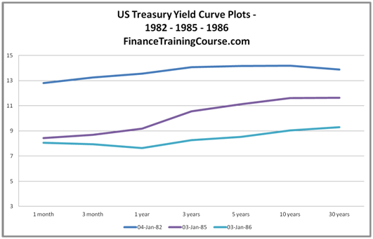
A yield curve is a plot of the yield to maturity (YTM) of bonds against maturity (tenors) at a given point in time. To plot the curve all you need are the YTM of bonds of standard maturities.
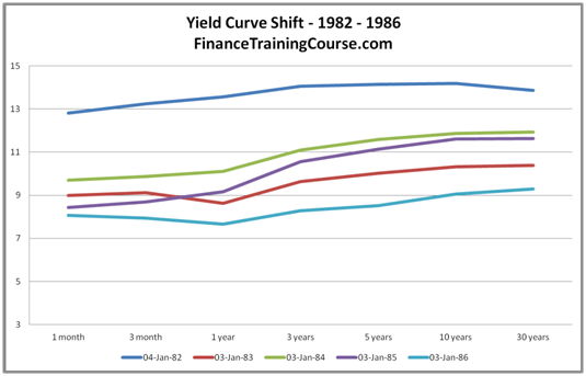
The figure above shows the yield curve history during the ’80s. Specifically, it plots the yield curves as of January 1982, 1985 and 1986 for US Treasuries. Each curve represents the YTM of 1 month, 3 month, 1 year, 3 year, 5 year, 10 year and 30 year US treasury bond at the given date.
Why US Treasuries?
For the longest period in recent history, the US treasury market remained the largest and most liquid trading market in sovereign securities. With 12 trillion dollars of outstanding issues and 2 trillion dollars of new issuances every year, it remains the largest bond market in the world. US treasury bills are treated as the default risk free asset class; the class that investors turn to in order to park excess cash when investor risk preferences in other risk asset classes change. However, with the arrival of Quantitative Easing (QE) and the beginning of the securities purchase program by the Fed, there are rising concerns and liquidity is becoming an issue.
Why study the yield curve history of shifts?
Bond prices change as interest rates move up and down. Fixed rate bonds with longer maturities are more sensitive by comparison to bonds with shorter maturities. We use modified duration to measure bond price interest rate sensitivity.
Depending on where interest rates are, a 30 year bond may drop by an amount ranging between 14% – 18% of original purchase value if interest rates move upwards by 2%. Or rise by a slightly higher amount if rates drop by 2%. From both risk and portfolio management point of view, a review of yield curve history to gauge an outlook on interest rates and the impact of that outlook on your portfolio is a key part of a fund manager’s mandate.
What types of yield curve shifts are common?
A yield curve can move in a variety of ways. A look at yield curve history shows that the most common form a yield curve may take is an upward sloping curve.
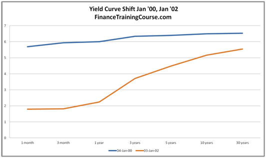
Yield curves can also be flat, inverted and steep. Flat curves are generally an indicator of a slowing economy. Inverted curves are taken as leading indicators of an upcoming recession while yield curve steeping points towards economic recovery.
The most common shift for an upward sloping curve is parallel, where yields move by similar amounts across all tenors.
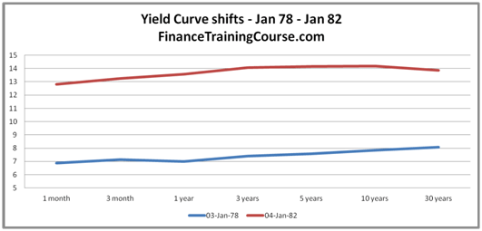
Which is what happened between January 1978 and January 1982. However, if you only looked at these two dates and curves you would miss out on a fair amount of interesting action in the interim period.
The 1978 – 1986 yield curve shifts
Paul Volcker is widely credited with a pre-emptive strike against inflation rates that ended the US economy’s stagflation crisis in the late ’70s and early ’80s. To combat rising inflation, the Federal Reserve raised the Federal Funds rate to 21% by June 1981. What the image below doesn’t show is how the pre-emptive strike was rolled out and its impact on the longer tenors of the yield curve.
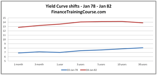
The next two images us walk us through the sequence of rate changes over the years between 1978 and 1982.
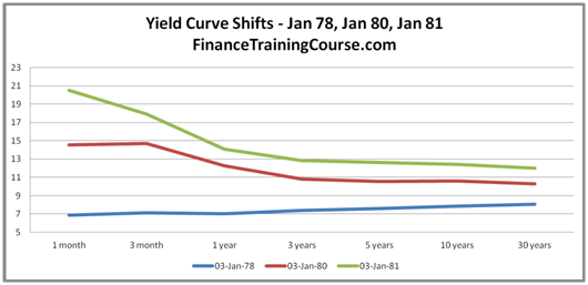
Rates keep on rising on the short end of the curve and pull up the 30 year tenor with it. The curve in January 1981(the line in green) represents a great example of an inverted yield curve – a curve where shorter maturity rates are higher than longer tenor rates.
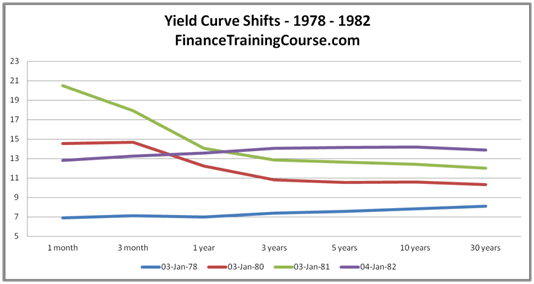
With inflation under control, the yield curve begins to settle down by early 1982. Once it becomes clear that stagflation is no longer a threat, rates are lowered slowly over the next 4 years.
Yield curve steeping – Three case studies – 1992, 2001-2002, 2008-2010
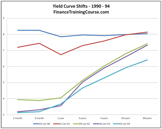
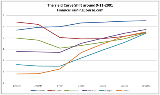
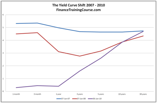
Yield curve history usually suggests that a steepening curve pointed towards economic recovery. Looking at US Treasury yield curve pre and post recessions as well as during times of major economic crisis we see a ran curves first invert and then steepen as they react to rate adjustments by the Federal Reserve in its attempts to slow down the economy (as inflation rise) and then restart it (as growth rate and inflation fall).
Why is studying yield curve shifts important now?
ZeroHedge penned an interesting article on the direction the yield curve is likely to take in 2010. It reviews yield curve history, future expectations, and the resulting trades that investment banks are recommending to hedge your exposure.
The essence of that piece and Figure 10 below is that the period of low volatility in rates is more or less over. If history is any indicator of future behavior over the next few years both longer term as well as shorter term yields are likely to move violently. As a fixed income portfolio manager, a lack of awareness and preparedness will result in you paying a significant penalty.
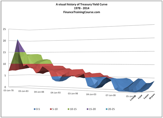
At the same time a bigger challenge with applying historical data, trends and tools in an environment where history is most likely not going to be the best of predictors especially when it comes to yield curve dynamics.
Check out the updated Historical Yield Curves January 2013 to November 2019 analysis. Is a US recession eminent?

Comments are closed.